Takeaways from a website redesign
This summer, I've gone on a rampant refactoring spree, leaving hardly a file in my website's source code untouched. It started with a redesign, prompted by a realization that my homepage wasn't as clean as I thought.
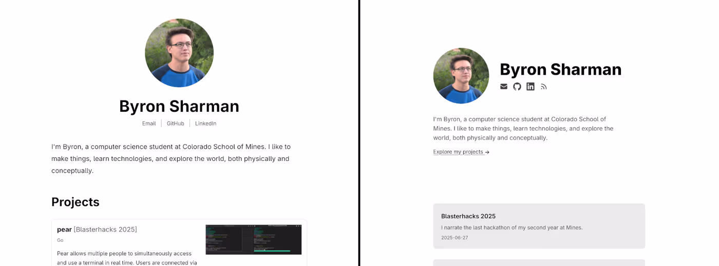
This kicked off many tiny changes over the next two months. I'm writing them down to increase the chance I remember them, and who knows? maybe someone reading this will find them helpful, too!
What I learned
1. CSS variables are really useful
I knew of their existence previously, but this was the first time I realized they'd be helpful in my own project. I found myself reusing the same text colors frequently, so I defined a couple variables:
@theme {
  --color-fg-primary: var(--color-black);
  --color-fg-secondary: var(--color-neutral-700);
}
2. Anyone can contribute to the MDN
The MDN Web Docs are some of the best documentation I've used, so I was surprised to find a typo one day. This led me to discover that they accept contributions, so I opened a PR.
I'd have to learn more about the project to know whether it's more helpful to batch small changes like this into one PR to reduce maintenance burden, but considering this was my first contribution, I felt OK picking something easy. Thought it's a very small change, it feels cool to have played a part in such a well-respected resource!
3. calc() is awesome
CSS's calc() function can be super powerful, allowing for creative
workarounds and elegant solutions that would otherwise be precomputed magic
constants. When combined with variables, it can be used to compute derived
values from a set of base values, which is incredibly useful when designing a
consistent theme.
4. Touchscreens can be specifically targeted with the pointer media query
I used @media pointer to make my social media icon links bigger on
touchscreens.
5. By default, Vite bundles everything in /static
Before, I would've been able to say this if asked, but I didn't realize its implications. Some internal files like the Markdown source of my blogs were being published with my website. I created an assets directory for anything I didn't need or want to ship in production.
6. <article> isn't only for articles
I think this element is poorly named; one would certainly think it is for
articles! However, at the time of writing, the MDN describes the element as
representing a "self-contained composition", and further searching led me to
believe that it was a better choice for my blog preview cards. Previously, they
were <li>s in an <ul>; now, they are <article>s in a <section>.
7. Firefox doesn't support text-wrap: pretty
I apply text-wrap: pretty to my blog's <h1> to improve appearance. However,
I realized that at the time of writing, Firefox doesn't implement it, causing
"orphan" words to appear by themselves on a line. This led me to discover that
text-wrap: balance actually looks better on large screens anyway.
8. With SvelteKit, values computed from props need to be wrapped in $derived
Internally, blog dates are stored as Unix timestamps, and a component converts them into human-readable dates for rendering. However, I observed that when navigating between different blog pages, the date component would not update; Svelte's client-side rendering wasn't hydrating it.
I assume this is because when navigating between different pages of my website,
SvelteKit doesn't actually load a whole new page. Instead, it uses JavaScript
to delete the HTML elements that changed and reinsert the new ones. The date
lives inside a component, so Svelte never removes it from the DOM; instead, it
only checks if its contents need to be updated. When the contents are built
from a string constant, SvelteKit assumes they never change, leaving the
component untouched. To inform SvelteKit that the string is a dependency of
state that changes from route to route, use $derived.
Fun fact: To do the opposite (prevent Svelte from tracking a dependency), use
untrack.
9. In SvelteKit, $lib/server is the standard location for server-only utilities
Previously, utilities followed the scheme utility.server.ts and lived in
src/lib along with components, leading to a cluttered directory. SvelteKit
recognizes that anything in src/lib/server is server-side only, so I moved
the utilities to that directory and simplified the naming convention to
utility.ts. Components also got their own directory. After the
reorganization, my src/lib looks like this:
src/lib
├── assets
├── components
└── server
Counterintuitively, src/lib is a pretty common place to put assets that Vite
shouldn't ship along with static. This is (probably?) because it makes Vite
asset imports convenient.
10. Lazily loading images makes sites faster
I dabbled in various web metric tools and found that adding
loading=lazy
to my images improved render times and decreased the amount of data initially
sent over the network.
Notably, it's bad to lazily load images above the fold (i.e., visible in the viewport without scrolling). Noticing that it was very rare to have two images above the fold, I approximated this by lazy-loading all but the first image in a blog post.
11. Svelte has a PageProps generated type
This is a relatively new change at the time of writing. Before:
import type { PageData } from "./$types";
let { data }: { data: PageData } = $props();
After:
import type { PageProps } from "./$types";
let { data }: PageProps = $props();
12. Tailwind theme variables define custom utility variants
For example, if this code is added to the theme:
@theme {
  --spacing-std: --spacing(4);
  --spacing-lg: --spacing(8);
}
then anywhere a value would be used for spacing—e.g. my-4, gap-8,
etc.—there exist new valid values my-std, gap-lg, etc. This is a lot more
readable than my-(--spacing-std), and I'd imagine it's a life-saver when
designing a cohesive theme for a large app.
13. Margin collapsing is bound by block formatting context
Generally speaking, where two elements' margins would normally touch, the margins will be collapsed so that only the largest has an effect. However, this is only the case when the elements exist within the same block formatting context, which is not the case when one of the elements is a flex container.
I desired margin collapsing, as it made the margin above and below blog headers
equal, but a flex container used for centering had the side effect of creating
a new block formatting context that prevented collapsing. I worked around this
by calculating the remaining space after accounting for the margin of the
<main> element:
header {
  @apply mb-12 lg:mb-36 mt-[calc(calc(var(--spacing)_*_12)_-_var(--spc-std))] lg:mt-[calc(calc(var(--spacing)_*_36)_-_var(--spc-lg))];
}
which, although cool by virtue of functioning at all, is not readable. I
simplified this by using margin: auto instead of a flex container for
centering so that margins collapsed as expected. The above code became
header {
  @apply my-12 lg:my-36;
}
14. The <aside> element exists
From time to time, I found myself writing footnote-type things inside of a
<small> element inserted directly into Markdown. I realized this was becoming
a pattern, and that there is a semantic element for it, so I repurposed
Markdown's quote syntax to generate <aside>s. Now, this:
> **Note:** Like all deer, the moose *(Alces alces)* is an ungulate.
generates this:
<aside>
  <p><strong>Note:</strong> Like all deer, the moose <em>(Alces alces)</em> is an ungulate.</p>
</aside>
And renders like this:
15. There's a shorthand syntax for object initialization in JavaScript
This is another one that I already kind of knew, but not well enough to use it often. Instead of
const foo = { a: a, b: b, c: c };
a shorthand syntax can be used:
const foo = { a, b, c };
16. It's hard to deal with {@html ...} tags in Svelte
I use an @html tag to render the output of
marked.js. This method is fast, but it can't contain
components (which makes image optimization hard), and it can't be
styled with Svelte's
per-component style syntax.
Technically, an @html tag can contain components if the components are
rendered to strings of HTML using the imperative component
API. However, my main
motivation for desiring this capability was to use
enhanced:img in
blog posts. This is not a component but rather magic syntax parsed by a
preprocessor before Svelte even runs.
17. With Tailwind, CSS duplication is best handled by frameworks
Though it may be tempting to make a utility class to encapsulate the
combination of styles, it's usually better to represent repeated structures as
a component instead. For example, I had a set of styles shared between project
and blog cards. I used to have a card CSS class, but I removed it in favor of
a GenericCard Svelte component. This way, I reduce duplication in the HTML as
well as the CSS.
If this is impractical, convenience classes are best defined in Tailwind's
@layer components.
18. Vite asset imports have query parameters
Importing can mean a lot of different things. Sometimes, it's desirable to directly apply the styles in a CSS file; other times, it's more useful to get the file's URL or raw content. Vite's asset import queries allow specification of import type. The queries I use for my website are
?url, which directs Vite to import as a URL, and?raw, which directs Vite to import as a string.
19. CSS files can be imported conditionally on media queries
After implementing the redesign, I decided to add dark mode. One complication I
hadn't foreseen was changing the syntax highlighting theme based on the value
of prefers-color-scheme. I first approached this by using JavaScript to
import light.css or dark.css conditionally, but then I discovered a much
better way that only uses CSS.
@import "light.css" (prefers-color-scheme: light);
@import "dark.css" (prefers-color-scheme: dark);
This illuminates a bigger theme, which is that it's best to try to implement features in HTML and CSS before resorting to JavaScript, for several reasons:
- The browser can fetch render-blocking resources ahead of time when it doesn't have to execute JavaScript to identify them.
- Features built without JavaScript are often faster.
- JavaScript is disabled more often than one would think.
- What required JavaScript 5 years ago—or even 5 months ago—might not anymore.
20. Oklab is nice
Computers read colors as levels of red, green, and blue, but it's not intuitive to design a color palette from those values, as the physical pixel values don't align with perceived values. For example, in RGB, yellows are bright, and purples are dark. Oklab is a color space with smooth gradients between different values of lightness, chroma, and hue. It excels at mapping between technical values and human-readable and -writeable values, and it's fast, since converting between RGB and Oklab only requires arithmetic and matrix multiplication.
Only introduced in 2020, Oklab is already the industry standard color space in many disciplines, a testament both to the genius of its inception and the remarkable speed at which web development moves.
From a technical standpoint, it's useful to define the colors with variables
L, a, and b (lightness, green–red, and blue–yellow), but designers prefer
to define them with L, c, and h (lightness, chroma, and hue). The CSS
function for this is
oklch().
This is how all Tailwind's built-in colors are defined.
Combined with calc(), oklch can compute a new color from an original,
adjusting just one parameter, which is very powerful. To calculate secondary
background color, I leverage these two CSS functions to apply a constant
lightness difference to the primary background color.
:root {
  --lightness-diff: 0.1;
}

@theme {
  --color-bg-primary: var(--color-white);
  --color-bg-secondary: oklch(
    from var(--color-bg-primary) calc(l - var(--lightness-diff)) c h
  );
}
21. color-mix() is awesome
color-mix() returns the result of mixing two colors in a given colorspace. I
use it to calculate the text color of my blog, as the right value seems to be
between Tailwind's --color-neutral-800 and --color-neutral-900.
22. Use logical direction CSS properties
It's natural to assume that the top or left is always the beginning of an
element. For example, to implement the following <aside> styling, would it
not make sense to simply add a left border?
This doesn't work in right-to-left languages. It's better to convey meaning
instead of implementation by placing a border at the start of the element
with
border-inline-start.
Other CSS properties have similar equivalents.
23. Biome is great, but not for Svelte (yet)
Biome is a JavaScript linter/formatter/etc. written in Rust. Since education and enjoyment are principle reasons for my website's existence, it makes sense to try the cutting edge of Rust-based JavaScript tooling with Biome. Biome is very fast, has a good LSP, and makes configuration easy. However, it doesn't yet support parsing inside Svelte components, which means that important features such as detection of unused imports and variables do not work in Svelte files.
For the time being, I'm content with this. I wouldn't see meaningful gain by switching to a different set of tools.
24. TypeScript is nice, but it feels complex
Sometimes I wonder if the power of the type system is really worth the complexity. For example, I wrote this entire narrowing function which is essentially boilerplate:
function validateCategory(category: string): category is ProjectCategory {
  return (PROJECT_CATEGORIES as readonly string[]).includes(category);
}
Granted, the better I get at TypeScript, the more often I discover my existing
approach was overly complicated. Nevertheless, it feels like there's a lot of
(typeof Foo)[keyof typeof Foo]-esque nonsense to wade through before getting
to the good stuff.
25. Image link alt tags should describe the link, not the image
The MDN points out that it's more helpful for people using screen readers to hear where the link will take them than to hear what the link icon looks like.
For the webring at the bottom of the homepage, the image links are inline SVGs,
so I use aria-label instead of an alt tag.
26. Locality engenders simplicity
Blog metadata used to be stored centrally in a JSON file. I split it per blog and moved it to YAML frontmatter, a standard in which YAML definitions are placed at the top of a Markdown file. Now, instead of fetching from where blogs should be according to JSON, I use a Vite glob import to parse all Markdown files and their metadata.
Don't tell this to a microservices fan, but separating related systems leads to complexity because the systems have to be tied together. Not only was I able to make the simplification described above, I also saved myself the mental burden of having to perform the tying-together in my head when editing metadata corresponding to content in a different place.
Conclusion
I learned a lot working on my website, but I had trouble describing my growth because it was mostly random bits of useful information. By writing it all down, I quantify and reinforce those pieces of information, accumulating them into the mass we call knowledge.
Amidst our excitement over AI, we sometimes forget the value of little morsels of progress gained from solving easy problems ourselves. When those problems are solved for us, we are less likely to internalize the lessons. I hope to remain steadfast against these trends by doing the opposite: increasing the likelihood of learning by writing it down.
Happy hacking!